Vintage Dansk Bistro Dinnerware in Christianshavn Blue
 |
| Vintage Dansk Bistro Christianshavn Blue |
I began collecting the Bisserup White for my personal use in the early 1980's and continued to collect that pattern until the mid 1990's.
It was a tough choice for me between the Christianshavn Blue line with the white winning out; but I did collect some of the Christianshavn Blue in select pieces such as the espresso cups and saucers It was after all the mix and match collection!
The Designer for Dansk Bistro - Niels Refsgaard
 |
| Vintage Dansk Bistro Chrisitanshavn Blue shown with Odin Servers |
Refsgaard and Dansk are the recipient of several design awards including:
- iF Product Design Awards - Niels Refsgaard for "Generation" Two Awards in different categories.
- International Tabletop Award - Dansk International Designs Niels Refsgaard designer, Dansk Bistro in the Dinnerware Design category.
Dansk Bistro - Christianshavn Blue - Design Inspiration
Dansk advertising described the Bistro line as "gleaming white porcelain in traditional colors - cool sea-blue and warm earth-brown -- he offers distinctive border to mix and match in endless combinations." Dansk hung their hat on the Bistro line, accompanied by copious companion pieces, they honed the Bistro brand through advertising not only the dinnerware but also "accessories" such as casseroles, bakers, quiche pans, ramekins and souffles in "The Cook's Collection" and the "Cook and Serve Collection".
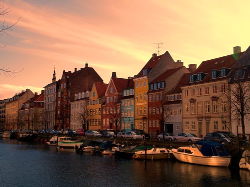
According to one Dansk ad, the inspiration for the line was "a charming Danish custom: to tile kitchen walls and working surfaces in a multitude of unmatched patterns." The sapphire blue and the earthy brown were named Christianshavn after the trendy neighborhood in Copenhagen with a mix of old and new architecture.
 |
Christianshavn at sunset is truly an inspiration!
Thanks to Serge Y on Flickr for providing HTML for his fabulous image.
|
Dansk Bistro - Mix and Match - Cook's Collection
A Tabletop Revolution
Minimalist Design - Influential Designers Compete for the Market
Minimalist tableware china wasn't a new concept, Rosenthal produced all white patterns since the early 1900's, Wedgwood also produced all white ironstone china from the late 1800's; however the overall pattern impressions were of more traditional profiles, shapes and donned ornate reliefs as borders. Pressure from Dansk's success was certainly seen in Rosenthal's developing a strong relationship with Danish designer Bjorn Wiinblad, the designer of Romance and German designer, Wolf Karnagel the designer for the Joy 1 (Joy One) pattern.
Dansk's Design and Branding Revolutionized the American Tabletop
 What Dansk accomplished through award winning designers like Niels Refsgaard and Kathleen Wills, combined with comprehensive product branding through the print medium, was to revolutionize and forever change the china and tableware industry and American tabletops.
While Julia Child was expanding our culinary skills and teaching us how to cook, Dansk was providing an expansive line of cook and serve ware which took meals directly from the kitchen to the table. It couldn't have been better timing and it was a perfect fit for our changing to a more casual lifestyle. It was indeed a new concept for upscale dinnerware. With styles and colors which further reinforced earlier offerings such a Kobenstyle enamelware and Teak offerings.
The line between everyday dishware and company china became blurred; for many like myself it disappeared altogether. Dansk reinforced that change through their designs and advertising. Designs became the frame for food instead of aesthetically competing. The clean tabletop visually captivating. The food took main stage center and the new designs allowed it to shine.
Many designs were rooted in European folk art. Refsgaard's designs in particular, are clearly born from Danish folk art, but certainly influenced by his travels; textures and patterns which were heretofore more apt to be found on stoneware than fine porcelain. It worked then. It still does!
Timeless Design
 |
| Tricia's Cool Blue and Green Table Setting featuring Dansk Kristina & Florencia pattern by Refsgaard |
Above is pictured Dansk's current Kristina & Florencia pattern by Refsgaard which would mix and match perfectly with vintage Bistro Christianshavn Blue. A special thanks to Tricia, of the Dull and the Dutiful, a tabletop blogger, for allowing me post her lovely tablescape! She has fabulous seasonal tablescapes (several which are Dansk) and a visit to her blog is a must! You can see her outstanding work including her Easter table here: The Dull and the Dutiful Blog
Modern designs do have their detractors, one online review of Dansk, calls it "clinical". Of which I hardily disagree. Dansk Bistro Christianshavn dinnerware would be as beautiful on Monet's dinning table in his yellow dinning room at Giverny as it would on any traditional or contemporary dinning table such as Tricia's beautiful table shown above.
The Bistro Christianshavn line transcends, just as intended! As Dansk stated so well in a 1980's advertisement: "From our earliest beginnings, Dansk's commitment has been to create designs that are always timely because they are timeless. So when you buy Dansk, you know that your are buying style that lasts, not a fashion that comes and goes. It's the guarantee that your tabletop will always be a winner."
I couldn't agree more.
Vintage Dansk Bistro Christianshavn Blue presents Classic Stripes - Compatible with all the Bistro and complementary patterns:
- Fredriksborg
- Maribo
- Flora
- Flora in Solid Blue
- Bistro Bisserup Brown
- Blue Ringsted
- Lyngby
- Bistro Bisserup White
It is no surprise that Dansk Bistro won First Prize for Classic Dinnerware in the First International Tabletop Awards competition.